
")
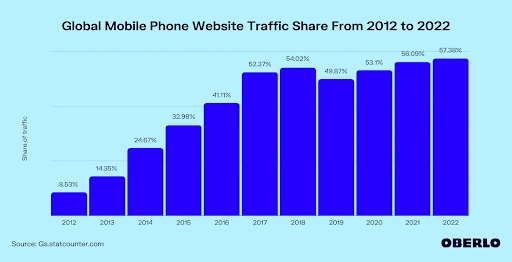
AMP and Responsive Web Design – As of February 2022, more than 57% of website traffic comes from mobile devices. The figure was around 8% a decade ago.
The steady increase in the share of mobile devices in web traffic bears testimony to the importance of going mobile. That’s why it is important for webmasters to ensure that their website loads quickly and nicely on mobile devices. After all,
- 64% of users expect a website to load on their mobile screens within 4 seconds.
- And people who have a negative mobile experience are 62% less likely to make a future purchase.

Loading speed boost. Fast internet browser, modern online technology, accelerated download time. Smartphone performance optimization, improvement. Vector isolated concept metaphor illustration
Thus, experience and page load speed are important parameters while developing mobile sites.
Now you have two ways to achieve these goals:
- Get Responsive Website Designs from a full service WordPress agency.
- Rely on Accelerated Mobile Pages.
Both can make your website ready for mobile users. However, they do differ in some aspects. And you will eventually have to pick between the two for your website.
This guide right here will help you understand:
- What is AMP?
- Advantages and disadvantages of AMP
- What is Responsive Website Design?
- Advantages and disadvantages of Responsive Website Design
- The difference between AMP and Responsive Website Design
- How to decide between AMP and RWD for your business mobile website
Table of Contents
Accelerated Mobile Pages (AMP)
Back in 2015, Google launched an open-source HTML framework. It aimed to provide lightning-fast speed and an engaging mobile experience to users. This framework is called Accelerated Mobile Pages. And it makes both creating and consuming mobile content faster and easier.

AMP prioritises user experience on your website while making sure the load speed is blazing fast.
The key advantages of using AMP include:
- Google saves the AMPs in its server cache. This means the pages load directly from Google’s servers and not your hosted servers. That’s how AMPs are extremely quick-loading.
- With the use of AMP JS, an open-source JavaScript code, you can make your mobile web pages super fast and optimised.
- Google also introduced AMP HTML, which is slightly different from regular HTML. This HTML format allows modifications as per your requirement without the related load delays.
- Embedding images into your page content is also slightly different for AMPs. You have to <amp-img> </amp-img> tag instead of the regular <img> </img> HTML tag. This sets an inline style for the width of the element to ensure that it loads perfectly and quickly on mobile devices.
Like everything else, AMP is not a perfect offering. It has its fair share of shortcomings, including
- AMPs can only have a single embedded style sheet. This means you cannot use external styles on AMP webpages, except for some custom fonts.
- AMP works great only with static content. With more components that are dynamic in nature, AMP’s load speed takes a hit.
- You cannot use third-party JavaScript with AMP as you are limited to the use of only AMP JS. This might mean cutting down on some features on the page.
Responsive Web Design (RWD)
Back in the early 2010s, people started accessing the Internet on many devices and not just their desktops. That’s when the need for Responsive Web Design arose. Before the introduction of RWD, web designers had to design and develop multiple versions of the same website for different device types and sizes. The process was costly, time-consuming, and cumbersome. With the introduction of RWD, flexible images and fluid layouts let web pages fit on any device. Without compromising on the look or user experience.
The key advantages of using Responsive Website Design for your web pages are:
- With RWD you get unmatched flexibility. Your page automatically responds to the visitor’s device type and size.
- Responsive Web Design lets you offer an engaging user experience on any device type or size.
- There are no limits on the use of CSS or JavaScript in responsive web design. Whether it is a third-party plugin or framework you can easily add it to the page.
- RWD allows adding external CSS files. This ensures a stylish display without compromising anywhere.
While Responsive Website Design is generally great, it does have some downsides, like
- Code density, asset size, plugins, server performance, and many other factors can negatively affect the load speed of a responsively designed web page.
- The ability to use external JavaScript comes with the additional responsibility of optimising the third-party code by compressing the CSS and JS to ensure adequate site load speed.
The difference between AMP and RWD – Different Goals
Broadly speaking, both accelerated mobile pages and responsive web design aim to make sure your visitors can access your web page easily on their mobile devices.
But when you look carefully, the two are vastly different. Primarily in terms of their goals.
Accelerated mobile pages focus on load speed while Responsive Web Design is aimed at flexibility.
Other differences between the two include:
- RWD is a method of organising and designing a website. AMP on the other hand is a framework.
- AMP delivers content to mobile users instantly, while RWD can be used to seamlessly display on any device and not just mobile phones.
- To be able to reap the benefits of RWD, you have to replace or rework your current website. That’s not the case with AMP. You can simply add independent AMPs without redesigning your website.
- AMP is limited only to static content, but RWD can be used for websites with dynamic content too.
Thus, we can conclude that:
- AMP is ideal for news platforms, blogs, informational pages, and other web content.
- Responsive Website Design is more suitable for custom applications, web forms, and the like.
Choosing between AMP and RWD for your mobile site
45% of people want content that displays equally well and quickly across all their devices. That means you do need to work on your site’s responsiveness and speed both.
Other than user experience, even Google’s search algorithms favour websites that offer a good user experience.
Now, if you use Responsive Website Design for your website, your website will be not just mobile-friendly, but load seamlessly on any device or screen size. But that responsiveness comes at the cost of speed.
AMP, on the contrary, is designed for speed and mobile experience. Plus, it is a Google offering, which gives it an edge in search result rankings too.
However, the choice between the two should depend on one important factor – your audience.
- If your audience is likely to visit your website via mobile devices, AMPs are the right choice for you.
- But if your website is accessed by users on multiple device types like desktops and tablets too, Responsive Website Design would be a better fit for your needs.
Thus, to be able to decide between Accelerated Mobile Pages and Responsive Web Design you need to know more than just about these two solutions.
And the best way to make the choice? Consult experts. Website development experts can sit you down, and walk you through the cost, complications, and outcomes of both AMP and Responsive Website Design. Based on this information, you can make an ideal choice. Or who knows, maybe find an ideal balance between the two and use both.
Ready to offer a wonderful experience with your mobile site? Talk to experts and leverage AMP and Responsive Website Design today!